But there is one issue I'm aware of; a growing mismatch between NCEP/NCAR reanalysis and GISS Land/Ocean Temperature Index (GISS LOTI).
I've obtained GISS LOTI data from here, it is provided in various latitudinal bands, it uses a baseline of 1951 to 1980. So I've used this page to create a set of NCEP/NCAR temperature data, grids area-weighted, which are presented as absolute values, not anomalies. I've then calculated the average for 1951 to 1980 so as to re-calculate the NCEP/NCAR temperature data as anomalies on the same baseline as the GISS LOTI data. The NCEP/NCAR data cover 64degN to 90degN latitude and 0 to 360degrees longitude, the same region as the Arctic subset from the GISS LOTI data. Note that the resultant NCEP/NCAR output is presented from 65degN longitude, not 64degN.
Plotting the NCEP/NCAR and GISS LOTI data on a graph produces the following.
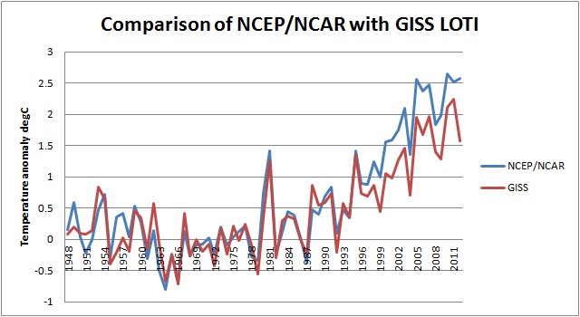
This shows that NCEP/NCAR and GISS LOTI show reasonable agreement up to the mid 1960s, after which agreement is excellent, until around 1997 when the NCEP/NCAR reanalysis shows far greater warming than does GISS LOTI. In view of the excellent agreement of inter-annual variations between the two datasets from the mid 1960s onwards, I presume that the early period of reduced agreement is probably due to data availability, both in terms of GISS and in terms of the observational data used to drive the model that produces the NCEP/NCAR reanalysis data. Given the differences in approach the agreements are impressive, if unsurprising, as it shows what a good job has been done in working out both datasets.
But what then of the later period where the reanalysis shows much more warming than the meteorological station data from GISS?
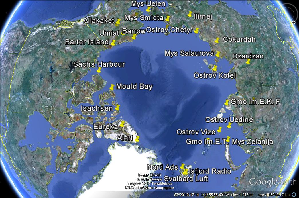
Below is a Google Earth map of weather stations used to provide data for GISS LOTI, this isn't all of them, but it is the majority and is enough to show what follows.
Next I've plotted NCEP/NCAR on the same terms as GISS LOTI: using this page I have plotted a composite map of temperature fields. This represents the average temperature field for 1951 to 1980, which is subtracted from the average temperature for 2007 to 2012, and plotted to show the difference between the two periods. In effect this is the temperature field anomaly from the GISS baseline average period. I've chosen 2007 to 2012 partly because of interest in post 2007 Arctic system dynamics, partly because during this period there is an apparent relative levelling in both GISS LOTI and NCEP/NCAR.
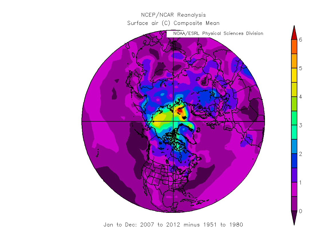

The agreement is good, however the GISS LOTI seems to be smearing the warming over Eurasia into the Arctic Ocean, whereas NCEP/NCAR suggests that there is greater warming within the Arctic Ocean. This smearing is because based on findings in Hansen & Lebedeff 1987 (Abstract and PDF), the climatological temperature field is found to be robust at distances of up to 1200km. So GISS LOTI uses a weighted interpolation to cover regions of sparse meteorological station coverage. This means that it treats the Arctic Ocean as if it has the same warming signature as land based meteorological stations bordering it.
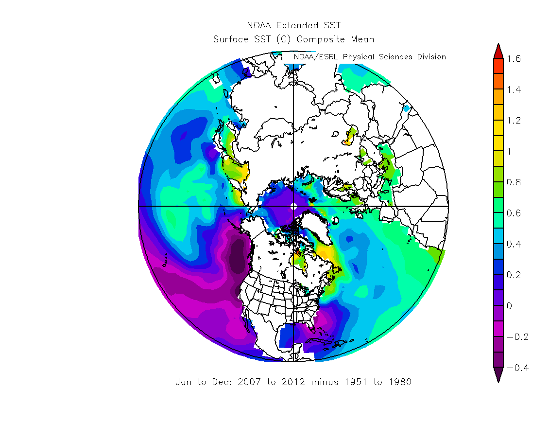
Before proceeding I should note that GISS LOTI also uses NOAA ERSST for sea surface temperature. That's not available from NCEP/NCAR but NOAA Extended SST is, and is plotted below, the differences between the two are not likely to be significant in terms of the land warming signature.
So why is the Arctic Ocean warming more than the surrounding land?
Using the timeseries page of NCEP/NCAR I downloaded a month by month series of temperatures for the region 70degN to 90degN and 100degE to 230degE, a region covering much of the Arctic Ocean. Converting these to anomalies using the 1951 to 1980 period and calculating the average anomaly for 2007 I calculated the average temperature anomaly for 2007 to 2012, for each month of the year.
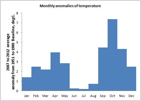
As with the previous post on Arctic Amplification it is apparent that summer warming is negligible, this is due to energy going into melting ice, not raising temperatures. However the latent heat of energy melting ice, and ocean warming, is released in September to November, with later warming possibly due to thinner ice and ice growth.
These temperature anomalies will only be picked up by a handful of meteorological stations on islands in the Arctic, therefore will not be being strongly represented in GISS LOTI. It seems to me that rather than concluding that NCEP/NCAR is wrongly showing warming of a pattern shown by other reanalysis datasets, and backed up by mechanistic understanding of the changes in sea ice, it is more likely that GISS LOTI is missing a significant element of warming that could be as large as an extra 0.5degC in the annual average.
But before I close an idiot check on the NCEP/NCAR data is necessary, and it can be done using some of the station data available from GISS, here. I've used Ostrov Kotel, Gmo im EKF, Ostrov Vize, Ostrov Uedine, and Ostrov Dikson. Ostrov Kotel is in the East Siberian Sea, but the others are in the region of NCEP/NCAR's greatest temperature anomaly. Ostrov Uedine is included as an extra site to calculate the 1951 to 1980 baseline. For the sites in the region of the NCEP/NCAR anomaly in the Barents Sea the average temperature anomaly for 2007 to 2011 is +5.32 degC, while NCEP shows warming of over 6deg at maximum. Given the uncertainties involved in missing data, a very basic approach of simple averaging, and a tiny number of data sources, the close result surprised me. Ostrov Kotel shows a +1.98degC anomaly, NCEP/NCAR suggests somewhere in the region of 3degC anomaly for that location, but here one data source adds even wider uncertainty bounds.
Until someone can persuade me otherwise I'll continue to use NCEP/NCAR as an essential part of my toolbox in understanding changes in the Arctic.
4 comments:
I say you are way beyond "Amateur Reader" :-).
Great analyses Chris. You should ask the owners of the two data sets on their opinion on why there is such a large discrepancy. If left unattended this could fuel denialists arguments about AGW being a data anomaly.
Thanks,
We'll have to compromise, the best I'll accept is an enthusiastic amateur. ;)
The denialist jerks will make up stuff whether real or not. When they show their lack of understanding by crowing about record autumn sea ice gains after record summer lows it just shows how little grasp they have of the subject they have. They're an irrelevant irritant.
I only email scientists when I need to. Unless anyone can show otherwise I view this matter as settled, so it's time to move on. There's so much more to learn.
Chris, this recent double blog pack is both helpful and anticipatory. Keep on investigating.
Thanks Arcticio,
I've decided to get back to blogging on papers that have interested me, so more to follow.
Post a Comment