Tamino has just posted about 2010 and what he's found in the PIOMAS volume data, this has driven forward the need for these posts. I think that people aren't aware enough about what happened in 2010 and that understanding it is key to understanding where we are with regards Arctic sea ice, and where we're headed.
I am asserting that 2010 was a key event, one with repercussions for the future, that will be seen in years to come as important a turning point as 2007 itself. Indeed 2010 may even have ushered in what Dr Peter Wadhams has said probably be a succession of crashes: "I think the next two or three years will see a further collapse and we'll then be encountering an Arctic ocean without sea ice in it during the summer months" BBC News 24, 19:23 27/8/12. A year ago I'd have disagreed, now I think he may be correct.
As regular readers of this blog know I have been sceptical of the 'early transition' camp, and rather scathing about extrapolation of curves, e.g. here. I still dislike curve extrapolation, but over this summer I have changed my views on when we will see a virtually sea ice free state (<1M km^2 CT area): I consider it to be virtually certain it will be this decade, it may be within a few years.
So why was the volume loss of 2010 so important?
Firstly it's important to get the issue in context. Here's the main PIOMAS volume series in blue, with interannual differences in red, source data. Click to view original size.
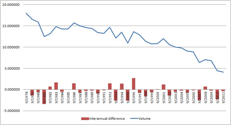
From this it can be seen that large volume losses are not uncommon, however they're having more impact as the overall volume decreases. But it can be seen that 2007 and 2010 are events of the same order of magnitude.
The importance of 2010 can be seen in the total timeseries of calculated thickness. Again click to see original size...
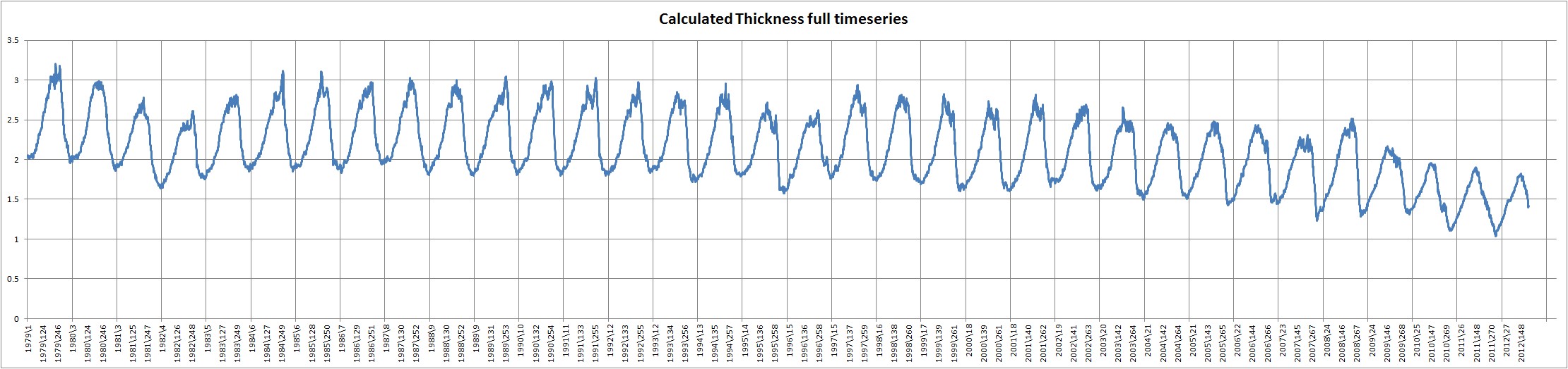
Calculated thickness is the result of dividing PIOMAS volume by Cryosphere Today area, source data. From this graphic it can be seen that whatever happened in 2010 has changed the seasonal cycle of calculated thickness. This is seen in the loss of the roof, which I have previously discussed here. The roof describes the relatively flat period, with little loss of calculated thickness, throughout the summer that typifies years before 2010.
My interpretation of this change is that previously there was less change of thickness during the summer because reduction in volume was largely accounted for by reduction in area. Both 2007 and 2010 show a drop in calculated thickness, but the aftermath of 2010 is very different. This implies that to account for the change in volume, loss of thickness is needed to balance the loss of area.
So why is it different?
PIOMAS thickness by grid box data has been obtained from Dr Jinlun Zhang's web page, see note at end of post. With it I've been able to work out the volume of various thickness categories of ice. The following graphic shows volume contributions to total volume from 4 bands of thickness.
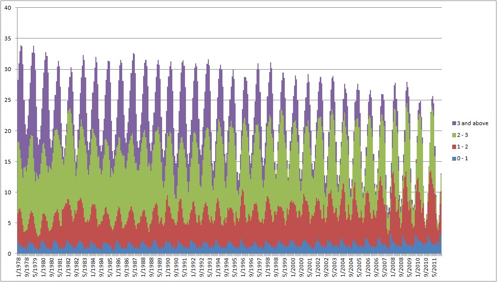
From this graphic it can be seen that the loss of volume in PIOMAS is due to the loss of ice over 2m thick. This agrees with the findings noted by Bitz & Roe, that in free running GCMs thicker ice thins more than thin. It also agrees with the findings of Kwok et al, who using ICESat and QuikScat found that the loss of Arctic thickness was due to the loss of thicker ice. So I take this behaviour as further confirmation that PIOMAS is on the right track. Bitz & Roe, 2004, A Mechanism for the High Rate of Sea Ice Thinning in the Arctic Ocean. Kwok et al, 2009, Thinning and volume loss of the Arctic Ocean sea ice cover: 2003–2008.
It is also important to note that after 2007 the winter contribution from ice between 1 and 2m thick (red) increases markedly, i.e. the ice has thinned in winter. However after 2010 the volume of ice over 3m thick hits record lows, indeed it almost totally disappears in summer. This is best seen in the September time series from the same data.
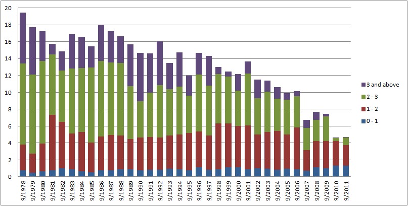
I should point out here that this is a graph derived from grid box averages - average thickness in the grid box averaged over a month. There will be some survival of thick ice (small amounts reappear in summer after reporting of zero volume from grid boxes), but not enough to bias the grid box average to over 3m thick. PIOMAS doesn't model at sub grid box scale, but in reality there probably is a residual of thick ice.
However the message is clear, in 2010 something happened that killed off virtually all the remaining thick ice. This change impacted the calculated thickness annual cycle up to the recent summer, so whilst I don't have 2012's thickness data it seems reasonable to conclude that this loss of thickness persists to the present.
It may reasonably be objected that PIOMAS volume is from a model therefore it is not certain that PIOMAS is showing something that happened to as great a degree in the real world. However PIOMAS modelled the events of 2007 accurately, has been validated against available observations (Schwieger 2011), and captures the loss of volume implied by comparison of ICESat and preliminary Cryosat 2 data, discussed here. I wouldn't argue too much about the absolute figures, but qualitatively, if PIOMAS is telling us there was a crash in 2010, I'm prepared to take that at face value until observational evidence refutes it. There are more obervations which suggest PIOMAS is on track, as it has been in the past.
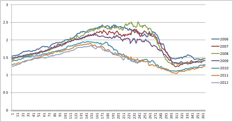
Cryosphere Today area anomalies suggest that in early June (around day 160) anomalies plummeted in the post 2010 years.

What is notable is that around day 160 the anomalies fall massively in 2007, and 2010 to 2012. 2010 shows a later rebound to lower anomalies, for the other years, 2007, 2011, and 2012, all of which are record area lows, the low anomalies persist. 2012's anomaly is lower than any for the same period throughout the summer. I do not think it is coincidence that the anomaly fall occurs as the ice edge retreat enters the Arctic Basin, that this happens in recent years without notable weather events is, I think, a consequence of thinning ice. The graphic below shows the difference in CT area from June 1st to July 31st, the early part of the melt season after the ice edge has entered the Arctic Basin, figures in M km^2.
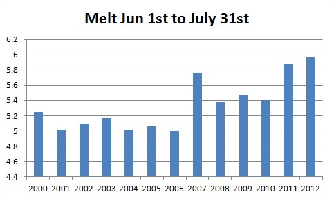
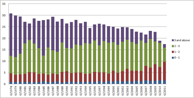
2007 shows an uptick in area loss because an influx of Bering warm waters due to a strong +ve Arctic dipole meant that early season melt was rapid. A similar step jump occurs in 2011 and is continued in 2012, why not 2010? Because in 2010 the thinning due to the events of that year weren't complete. As the previous anomaly figure showed, the retreat of the ice edge was very rapid initially in 2010, but slowed later in the season because ice further into the pack hadn't yet thinned. The following graphic shows thickness category volume contributions in June, clearly there was much more ice to melt out in June 2011 than in June 2010. Given the profile of anomalies for Cryosphere Today area, and the low sea ice concentrations that have typified the periphery of the pack this year, e.g. here, it seems reasonable to assume that in June 2012 the thicker ice was in a worse state than June 2011.
2011 and 2012 were critically thinned due to the events of 2010, so the ice retreat didn't stall, it just carried on. It is no accident that both years were area records and it is no accident that we have seen a crash this year.
Here are map plots of thickness for the years 2009 to 2011, to put conditions in context, the state of 2010 and 2011 with regards ice over 2m is exceptional in the context of the full PIOMAS record.

2009.
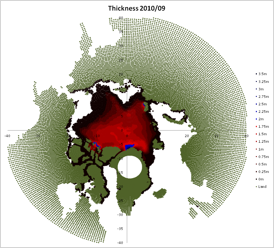
2010.
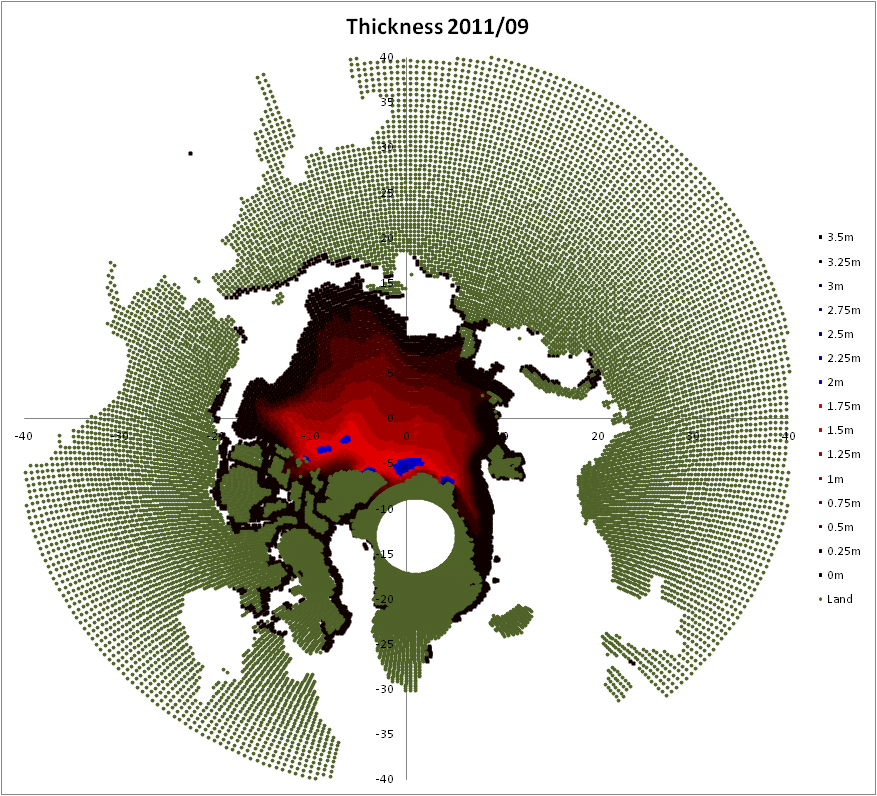
2011.
As to why the seasonal cycle of calcuated thickness has changed: I have a suspicion supported by some evidence that the thinner ice is melting faster and is 'taking a more active role' in the thaw season. Thin first year ice is noted to be more prone to melt than older, thicker ice. I'll post more on this in due course.
But this still leaves the issue of what happened in 2010 to cause the volume loss, and why this volume loss was specifically from thick ice. That will be covered in my next post.
The gridded data:
The data I've been made aware of are binary files of various indices from PIOMAS, see here. Luckily, while many indices are only available to 2004, thickness is available to 2011. I those binary files it's presented as flat data consisting of 43200 (360 X 120) grid boxes with the thickness at each grid point given in single precision floating point format, as I said above; I will post again about how I've accessed the data from Excel. Rob Decker has been good enough to help out with the thorny task of working out the area of each grid point (which is beyond my meagre maths), there is a small (<5%) seasonally varying error between total volume from this series and the main PIOMAS volume series. Neither Rod nor I have been able to sort out why. I've gone with the work Rob's done as this issue doesn't significantly affect the conclusions I'm drawing from the volume data calculated using the PIOMAS thickness and Rob's area.
ADDITIONAL: The spreadsheet used to calculate the breakdown of volume into thickness bands is now available here. A better version of the spreadsheet is available below.
ADDITIONAL: A new version of the spreadsheet using an improved (and far more simple) grid area calculation is available here. However the previous, version 1, remains the base data used in this post. Graphics and numbers for this post will not be updated in line with the change to version 2 because the version change does not change the conclusions drawn from the data. Thanks to Wipneus for the new area calculation.
No comments:
Post a Comment