I've pondered how to approach this post, but decided just to go through what I've done in a linear fashion, storywise, in the hope that people can follow my reasoning. Futhermore it's a very graphic heavy issue. However I don't like animated gifs because you can't pause them, so I've decided to put up with the risk of a slow loading page. All of the graphics are plotted with the same range of colour-values. I've presented only a small subset of the graphics I have viewed at NCEP/NCAR, after a point collecting them became superfluous.
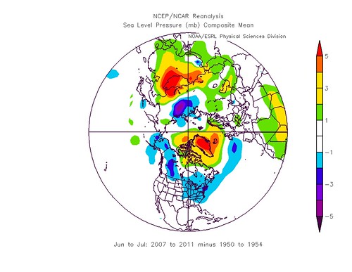
I used the period June to August as the summer, this is common to all the images here, as is the pressure scale. I was interested in whether the UK had a preponderance of low pressure systems during summers since 2007, so I looked at sea level pressure (SLP) from 2007 to 2011, and just for starters subtracted the previous 5 years, 2002 to 2006. This gave me a composite that was the difference in SLP between two equally lengthed periods, pre and post 2007. This is the result.
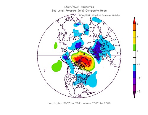
The general pattern is an area of higher pressure in the mid Arctic and Greenland, with a suggestion of a surrounding band of lower pressure. When I say higher/lower I'm referencing to the pre 2007 period. This is the pattern I looked into further...
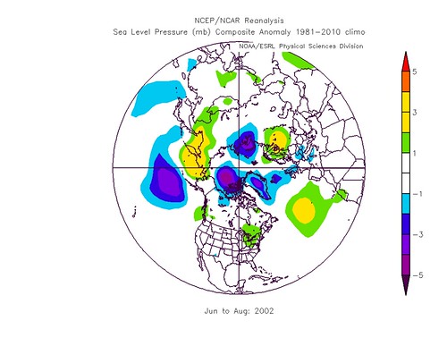
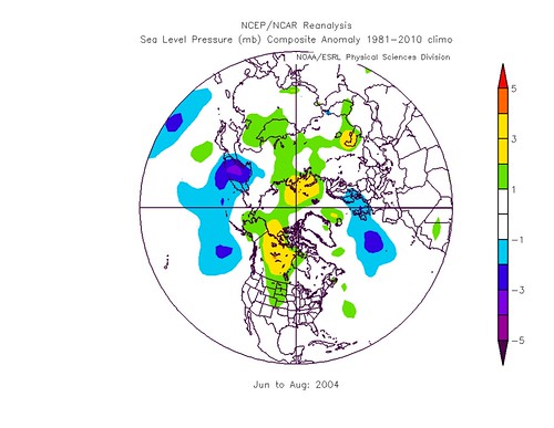
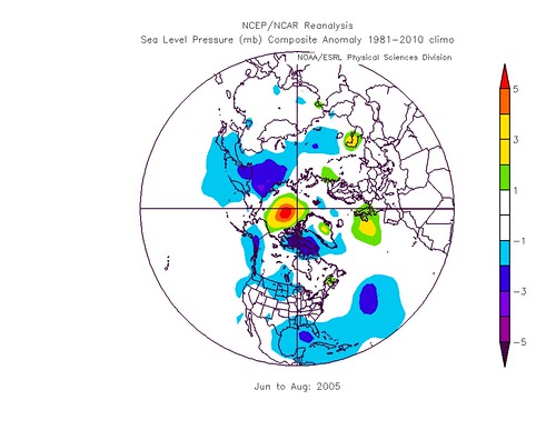
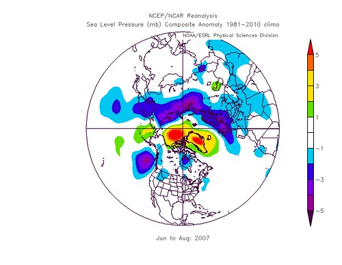
I wondered if this pattern was just due to general global warming: Would it be repeated in earlier periods? So I chose some 5 year periods at random and subtracted their mean SLP pattern from the mean SLP pattern for an adjacent 5 year period.
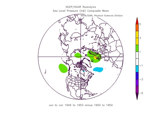
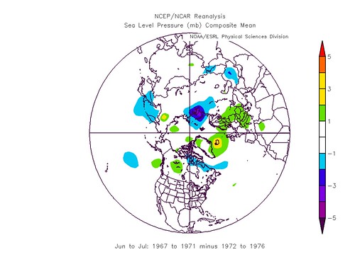

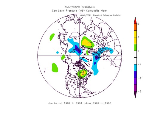
I saw year to year variations in weather, whichever way round I did it, no suggestion of a trend since 1950 that could account for the pattern I'd seen in the five years around 2007. What interested me then was just how robust this pattern around 2007 was.
So I took the period 2007 to 2011 and deducted from that some of the five year periods used above.

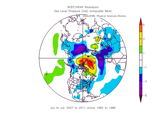
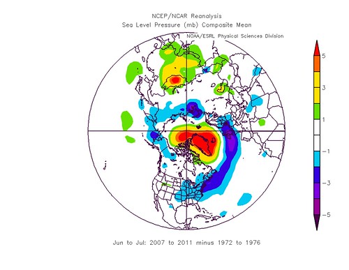
Frankly, the results amazed me! That the pre/post 2007 pattern appears robust when compared to disparate sets of years since 1950 was not what I was expecting at all! This pattern appears robust in the context of these randomly chosen periods, and more that aren't shown. This implies it is something new in the context of the second half of the 20th Century.
However the period of 5 years used for the above is rather a clumsy instrument: When did this change actually happen? Instead of using means I decided to revert to anomalies from the climatology and look at all the years between 2000 to 2011. This should show when this change happened precisely.

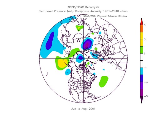


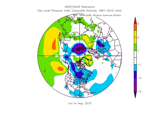

Obviously there's a lot of weather variation, as is to be expected. But in the post 2007 period there seems to be a tendency for an Arctic high anomaly ringed round with low anomalies.
Nothing I've read has lead me to expect such an apparently strong summer atmospheric response to sea ice loss. As 2007 was the year of the greatest crash so far it is tempting to point the finger of suspicion at areas of open water due to the anomalously low summer ice extents since (and including) that year. However IARC/JAXA extents for August 1st are (million km^2):
| 2002 | 7.78 |
| 2003 | 7.62 |
| 2004 | 7.86 |
| 2005 | 6.95 |
| 2006 | 7.09 |
| 2007 | 6.32 |
| 2008 | 7.10 |
| 2009 | 6.91 |
| 2010 | 6.82 |
| 2011 | 6.54 |
And in this respect the step-drop starts in 2005, with 2006 being matched with 2008.
I'm reminded of Stu Ostro's work, he has been drawing a link between ridge/trough formations in the atmosphere around the Arctic. His lecture slides are here, warning - huge 21 Mbyte pdf, page 51 and onwards shows what he's talking about.
But before I speculate any more I'll leave it at that and wait to see if anyone can point out the obvious explanation for all this that I've missed.
PS. On a parochial note - notice how the UK has been in low pressure anomalies since 2007? Now I see it I no longer care.
14 comments:
Chris - it's either new or due to one of the major oscillations. I think we can rule out the AMO. The 2007 to 2011 AMO is similar to 1953 to 1957 per this graph and a comparison (07 to 11 minus 53 to 57) results in this NCEP/NCAR SLP plot. Showing the same Greenland centered high pressure as your other NCEP/NCAR comparison plots.
I've found the post 2007 pattern in comparisons all over the NCEP/NCAR period (1948 to present) e.g. first batch of plots. Yet have not found the same pattern emerge when using the same method for periods other than 2007 - 2011 e.g. second batch of plots. This makes me think the post 2007 pattern is a novel pattern and is not related to any cycle with a periodicity of less than 50 years.
I've been over ENSO, AO, PNA, NAO, PDO, AMO. None seem to be able to explain these observations.
I have noted your comment on the Cooling of the Arctic Stratosphere post. I'm minded to leave that caution as it stands - it's a good point. But to address that point with regards these observations: You point out that the NCEP/NCAR reanalysis may not be well constrained in the Arctic due to paucity of observations. With regards sea level pressure (as opposed to upper tropo/strato temperatures) this is reasonably well-constrained in the Arctic due to weather stations and buouys. So I think what I've shown with NCEP/NCAR is a real process, not an artefact of reanalysis.
I still find the 2007 transition suggestive of a driving role for sea-ice, but I can't figure out how. Normally in a proper study this is the point at which you'd suggest how a modelling study might help identify the processes involved. In this case NCEP/NCAR reanalysis is a modelling study. So I have the data needed to explain this to hand. That said sorting out the data is not easy.
I still think that your original points about the apparent stratspheric cooling are related to what I cover in this post. Nothing in the atmosphere happens in isolation.
Chris - I don't believe it's a model artifact either, but thought we should keep the possibility in mind.
I would be very surprised if the two patterns aren't related. As Wayne Davidson told me over on his blog, "Everything is connected, there is no isolated system which acts completely independently from another."
The confounding thing is the pattern I stumbled upon is evident beginning in March-May 2007; yours in June-August 2007. Each of these starts BEFORE 2007's large sea ice extent losses. Looking at your NCEP/NCAR plots and both extent and volume data, I think 2005 is when the SLP anomaly begins to emerge and the correlated ice loss.
Are we looking at the effects of the emergence of the arctic dipole anomaly?
Interesting stuff. When following your graphics to determine when the change appears to occur I picked 2005 only to find 2006 to revert back. But then to see that 2005 ice loss was low, 2006 recovers some before the crash of 2007 it does seem to all fit. You really might be onto something here. But it doesn't bode well for the UK as it suggests cool summers and maybe even colder winters could be the new normal.
Kevin, Lazarus,
Keep challenging me with good points, I appreciate it.
Yes 2005 'reverts back', but so does 2010 - which doesn't really show 'the pattern'. One outcome of the atmosphere being so heavily interlinked is that you can't expect patterns to be present every season, even when they're as strong as this one seems to be.
So perhaps this pattern is actually from 2005 onwards? Interesting. It's striking that the bullseye doesn't seem to grow slowly, it suddenly appears in 2005, but only becomes prominent after 2007.
And yes the start is before the massive ice loss of 2007, although the start of that really was a massive loss in July.
I've pondered the Arctic Dipole too. Without a timeseries we're fighting with one hand tied behind our back. The best tool we have is NSIDC Sea Ice News, luckily on my first try I hit pay-dirt. The last four summers have been dominated by the Dipole Anomaly. NSIDC 6/6/11 That means 2007 to 2010. So maybe...
But check this out, it's units are Pascals, not mbar (which I use because NCEP/NCAR do) graphic of high pressure system, source. 'The pattern' exceeds 5mbar at it's most intense, checking NCEP/NCAR for that period (1/8 - 13/8/11) reveals that the high ranges between 1017 and 1021mbar. So the pattern agrees with that area of high pressure in area and pressure difference.
The pattern we're discussing does not agree in structure with the AD. For the AD you'd expect the high to be restricted to Greenland and the Canadian Arctic Archipelago, with the bulk of the Arctic low pressure. And we have evidence of this pattern appearing this year and being referenced by NSIDC as notable. So having started out writing this reply thinking it could be an outcome of the AD, now I very much doubt it.
Really what I should do now is trawl through week by week for a few summers to see when this pattern occurs.
But not tonight. After a hard week at work I'm having a rest. :)
PS.
Finally (!!!) stumbled upon "Dramatic interannual changes of perennial Arctic sea ice linked to abnormal summer storm activity." Screen et al 2011.
Right click and save document. Worth checking out.
Chris, sorry I didn't link to the paper; I did link to the other Screen & Simmonds paper, The central role of diminishing sea ice in recent Arctic temperature amplification that I found interesting.
Screen is one of the researchers I emailed a couple of questions. Haven't heard back, though.
I intend to read both Screen papers tomorrow. Couldn't find the one I linked to above on his publications page.
Had a day off all this today.
I've been thinking about this some more.
One thing that jumped out at me was that this was similar to the AO, however as it's a pattern that's only appeared recently just writing it off as the normal AO doesn't seem reasonable.
The monthly AO index for June-August since around 2007 has been unusually low. That index is made by "projecting the daily (00Z) 1000mb height anomalies poleward of 20°N onto the loading pattern of the AO". See here. The loading pattern is different from the pattern I've discussed in this post, however the similarities would be enough for it to cause a low index AO. Indeed this has happened, the summer AO index since 2007 is negative, except July 2010, the effect of which is seen above. However the late 1950s also had a low AO index period, which did not show the same pattern as I've shown above.
So perhaps what we're seeing is a distortion and intensification of the low index AO caused by the atmospheric impacts of the recession of sea-ice.
Responding to your post on my blog, Paul Hudson of the BBC has posted regarding the 'Indian Summer' here;
http://www.bbc.co.uk/blogs/paulhudson/2011/09/indian-summer-on-its-way-by-mi.shtml
The comments are overrun by the usual standard of climate change deniers.
For me the unseasonally warm weather isn't that unseasonal in my experience. As a kid I remember some glorious weather in the weeks after returning to school and it is when I first heard the 'Indian Summer' term.
Academically, understanding the technicalities of related science papers may be beyond me or at least more work than I'd like to indulge in during my free time. My degree and qualifications are in Technology and engineering after all.
But it does seem to be an emerging correlation in what you are looking at. Of course a single year may wipe that out but in my mind, ice loss, reduced albedo, and increasing temperatures in the Arctic all indicate and increase the chance of high pressure systems in that area which in turn could push the jet stream and colder weather south to form the so called 'blocking' patterns they say are responsible for our last few colder winters and cooler summers.
However I do remember it being predicted a few years back that global warming would bring milder wetter winters and dryer hotter summers - so far that isn't being borne out.
Lazarus, thanks for getting back on this.
I don't disagree that we've had these 'Indian Summers' before. The term itself suggests a long history of them, back to the days of empire at least.
I just think that the cool wet summers the UK has been having are part of a wider pattern.
1) An unseasonably warm period in April/May.
2) A cool wet summer, dominated by low pressure systems.
3) An Indian Summer in the autumn.
Whilst I think I've given a robust reason to think the summer pattern is odd, and probably connected with the loss of Arctic sea-ice. I think the other two are very much harder to demonstrate, if indeed they're in any way unusual. Partly because they refer to short periods (one to two weeks), partly because they're not likely to have the sort of substantial and atypical signature as the summer effect I outline above.
PS - regards your closing comment, yes the unknwon factor at that time was the Arctic ice cap's decline.
The comments on that blog are just idiotic.
Pingosan: "Arctic Ice has been growing for 4 years now. Look at the data." i.e. Pingosan hasn't had the vaguest brush with the data.
Paul Cottingham is living evidence of the Dunning Kruger effect.
Chris - I wasn't familiar with the 'Dunning-Kruger effect' ... so I looked it up. It falls right in line with a question I've often pondered: Smart people know they're smart, but do stupid people know they're stupid?
What I found interesting about the Dunning-Kruger tests were the cross cultural variations; i.e., more pronounced in the U.S., muted in Europe, and opposite in many Asian cultures.
++captcha= PRIDE
:)
I tend to take a broader view. Not just with respect to those who aren't 'intelligent' (always a matter of debate), but towards those who haven't properly learnt a subject.
It's typified by denialists who claim the scientists haven't considered some basic issue, like the lag of CO2 behind temperature during inter-glacials/glacials*. There's an arrogance some people feel after a few days of reading about a subject that they can see where the experts are wrong, when the experts have spent years studying and reading.
Dunning Kruger proposes that the experts view their grasp of the subject lower than some casual readers with a few hours of study behind them.
I constantly find myself unable to say things because I'm aware of not knowing some crucial element I need to answer in order to comment.
This doesn't mean I'm an expert, it may be a symptom of being a 'bear of very little brain'. ;)
* Now CO2 is a forcing, the increase being largely forced by emissions from fossil fuel burning. During the ice ages CO2 was emitted/absorbed by oceans as they warmed/cooled, so CO2 was a feedback.
My guess is this is due to open sea, creating favourable conditions for the polar high to 'sit' over the greenland ice cap.
This pattern is a permanent feature of the antarctic/southern ocean weather system, where an anti-cyclone sits over the ice cap, surrounded by a 'belt' of low pressure systems.
Ozone depletion, and hence a cooling stratosphere are though to be causing a strengthening of the Antarctic high, so perhaps a similar weakening of the thermal gradient between the troposphere and stratosphere favour this in the arctic as well.
Thanks Anon,
I'll consider that, it's a useful analogy. I'll check out NCEP/NCAR. One issue however is that whereas the south polar system is centred in the 'hollow' of the atmosphere over the pole, the Greenland high is offset from the centre when you look at the mean pressure field.
Post a Comment